
It's no secret that volatility has been a big deal in the bond market (and most other markets) recently. But there's no comparing the drama seen in Treasuries to the utter chaos in mortgage bonds. Well actually, there is.
We can certainly COMPARE the two, but when we do, it's easy to see just how different they've been. We did this yesterday with a chart of MBS yield spreads vs 10yr yields. That's meaningful for some market watchers, and it tells a story if you understand what you're looking at, but we can make things even more simple with today's chart. It's much simpler. The 10yr yield is plotted normally. The MBS prices are inverted (i.e. the higher prices are at the bottom of the y-axis and vice versa). This allows us to observe the typical correlation in securities that would typically move in the opposite direction (because one trades in yield and the other in price). In the most basic terms, I turned the MBS prices upside down in this chart so you could see things that would be hard to see otherwise.
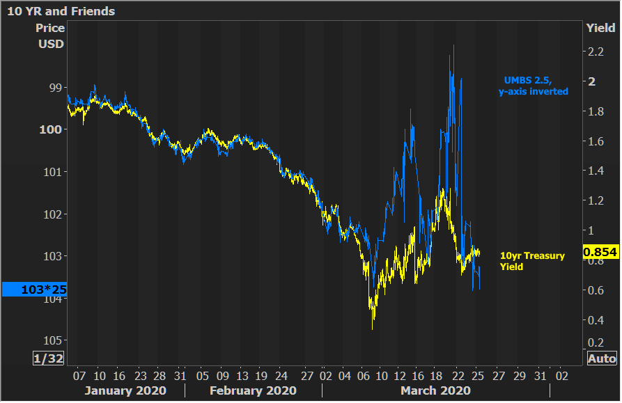
Conclusion: movement was well-correlated until March. The big spikes in MBS mean massive supply and mass liquidations. The recovery is 100% Fed intervention. The takeaway is that, in terms of relative performance, MBS prices have had a much better week than Treasuries as MBS prices are now back to March's best levels while Treasuries aren't even close.
Does this mean that MBS are outperforming Treasuries in the bigger picture? Not exactly. They're definitely not in bad shape, historically speaking, but they had already been underperforming in general since early 2018, as yesterday's spread chart showed (reposted below). The blue line is the gap between MBS yield and Treasury yield. Higher = MBS underperformance.

So how is this all translating to mortgage rates? First off, that would be easier to assess if lenders were closer to each other on any given day. They've been all over the place... But if we take the average of the most prevalent rates (and yes, I understand some lenders are still over 4% while others are closer to 3% today), we're still a long way from catching up to the rally in Treasury yields, and this chart doesn't even include the intraday yield low of 0.318% 2 weeks ago (because it's a weekly chart with only one mark per week). It's hard to see exactly where the blue line ends up depending on your monitor resolution, so I pointed out the current values for both lines with the arrows.

